
Still searching for the right place?
Use Map AI to explore, compare, and find the best fit - all with detailed insights and smart reports on any neighborhood.

America on Foot: Where People Still Walk to Work, and Why It Tracks Life Expectancy

September 3, 2026

11 min to read
America is walking to work less, and has been for fifteen straight years
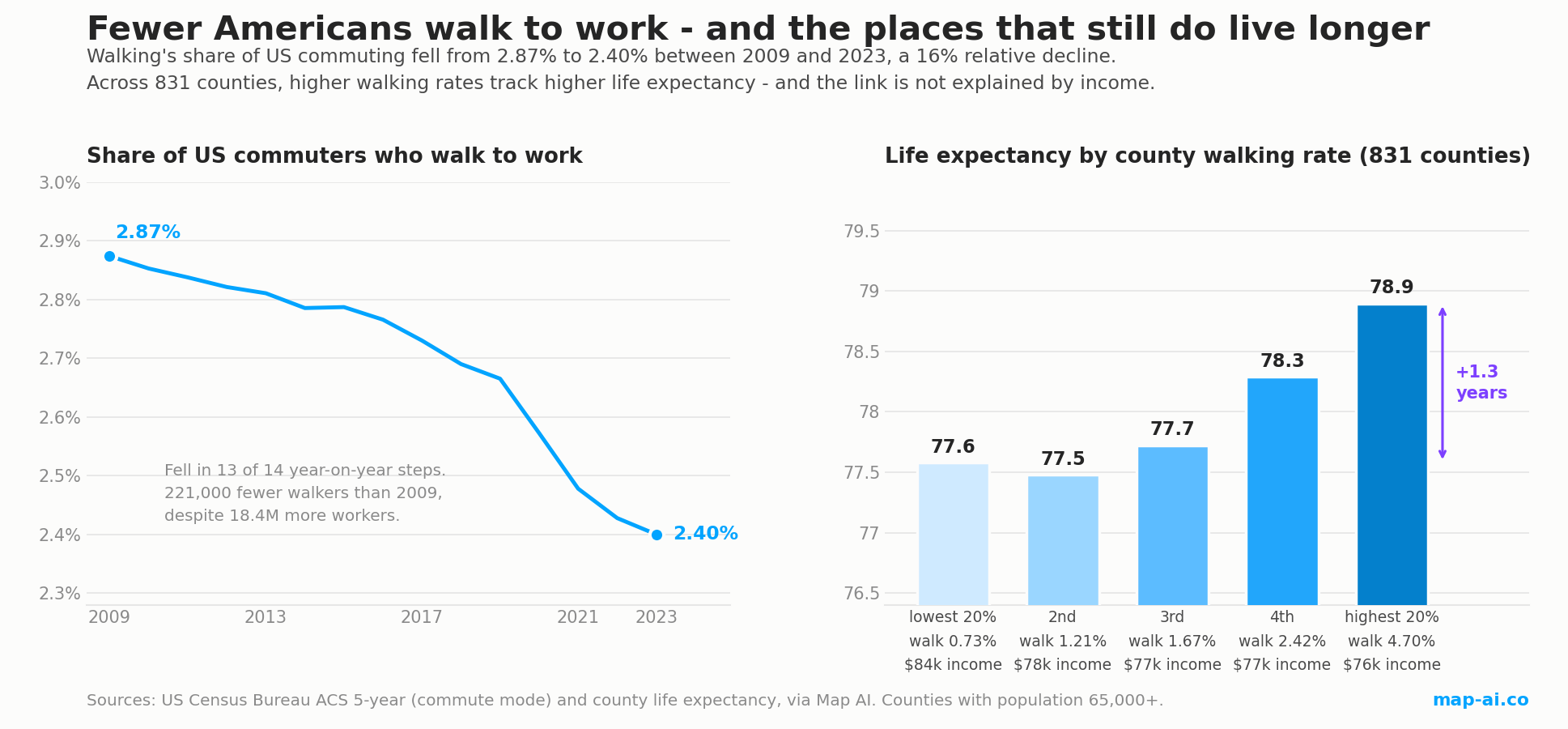
In 2023, 2.40% of American commuters walked to work. In 2009 it was 2.87%. That is a fall of 0.47 percentage points, or a 16% relative decline, and it happened without interruption: walking's share fell in 13 of the 14 year-on-year steps in this dataset, the single exception being a rise of two thousandths of a point in 2015 that sits far inside the survey's margin of error.
The absolute numbers are starker than the share, because the workforce grew throughout. About 4.02 million Americans walked to work in 2009. By 2023 it was 3.80 million, 221,000 fewer walkers, at a time when the country added 18.4 million workers. Had the 2009 walking rate held, roughly 4.55 million people would be walking to work today.
The decline also accelerated. Between 2019 and 2023 alone, 291,000 walkers disappeared, more than the entire net loss of the preceding decade. That timing points at the same cause we traced in our analysis of how Americans get to work: remote work. Jobs close enough to walk to are disproportionately the office jobs that can be done from a kitchen table, so the shift that took 6.6 points off car commuting took a proportionally larger bite out of walking.
All figures below are American Community Survey five-year estimates labelled by the last year of the window, so "2023" means the 2019-2023 period. That vintage is what makes county-level comparison possible at all.
Checking these numbers against published research
Before ranking anything, it is worth asking whether this dataset agrees with work done independently. It does, and on the part that matters most.
In Preventing Chronic Disease in 2020, CDC researchers Whitfield, McKenzie, Graff and Carlson published a state-level analysis of walking, biking and transit commuting using ACS single-year data for 2006 and 2017. They found national walking falling from 2.9% to 2.6%, with statistically significant decreases in 18 states.
Our five-year series puts the same national figure at 2.87% for the window ending 2009 and 2.73% for the window ending 2017. The levels differ slightly, as they should, since single-year and five-year estimates are different instruments. The direction and magnitude match.
The stronger check is the ranking. Working entirely from tract-level data aggregated upward, our 2017 figures put Alaska highest and Alabama lowest among the 50 states, at 7.95% and 1.12%. The CDC study, working from published state tables, reports exactly the same two states at the extremes, at 6.9% and 1.3%. Two different processing paths, the same answer.
That is the extent of what we borrowed: their published figures as a cross-check. Every ranking, trend and correlation below is computed from our own data.
The states where Americans still walk to work
| Rank | State | Walk share 2023 | 2009 | Change |
|---|---|---|---|---|
| 1 | District of Columbia | 10.04% | 11.30% | -1.26 |
| 2 | Alaska | 7.48% | 7.78% | -0.30 |
| 3 | New York | 5.71% | 6.28% | -0.57 |
| 4 | Vermont | 4.31% | 6.23% | -1.92 |
| 5 | Hawaii | 4.23% | 4.62% | -0.39 |
| 6 | Massachusetts | 4.20% | 4.53% | -0.33 |
| 7 | Montana | 3.97% | 5.28% | -1.31 |
| 8 | Maine | 3.49% | 4.08% | -0.58 |
| 9 | Wyoming | 3.35% | 4.06% | -0.71 |
| 10 | Oregon | 3.33% | 3.83% | -0.50 |
The striking thing about this list is that it is not a list of dense states. Alaska, Montana and Wyoming are three of the emptiest states in the country and all three sit in the top nine. Density is not what produces walking; proximity is. In a remote Alaskan or Montanan community the workplace is often inside the settlement, a few hundred metres from home, and there is nowhere else for the job to be. That produces high walking shares for entirely different reasons than Manhattan does, and it is why Vermont and Maine outrank far denser states.
Every state in the top ten declined. Vermont lost the most, down 1.92 points, roughly a third of its 2009 walking rate. Alaska lost the least, down just 0.30 points, which is what you would expect if geography rather than lifestyle is doing the work: you cannot remote-work your way out of a village where the job is the only job.
The states where almost nobody walks to work
| State | Walk share 2023 | Car share | 2009 walk |
|---|---|---|---|
| Alabama | 1.14% | 89.7% | 1.31% |
| Tennessee | 1.23% | 85.7% | 1.45% |
| Mississippi | 1.29% | 91.7% | 1.79% |
| Georgia | 1.33% | 81.3% | 1.67% |
| Florida | 1.39% | 81.1% | 1.64% |
| Texas | 1.44% | 83.0% | 1.78% |
An Alabama worker is about one seventh as likely to walk to work as an Alaskan and one ninth as likely as a Washingtonian in DC. These are car states by construction: post-war development patterns, separated land uses and long distances between housing and employment leave walking with nothing to do.
They are also, unsurprisingly, states that carry enormous vehicle volumes. For measured traffic counts on the roads that replaced walking in these places, TrafficZoom publishes per-state data: Texas, Florida, Georgia, Tennessee, Alabama and Mississippi.
Note that Mississippi, Georgia, Florida and Texas all lost a quarter or more of their walking share since 2009, proportionally steeper declines than the walking states suffered. When a mode is already marginal, small absolute losses read as large relative ones.
The top walking counties, and the pattern hiding in them
County rankings need a population floor or they fill up with statistical noise from places with a few hundred workers. Restricting to the 831 counties with 65,000 residents or more:
| County | Walk share 2023 | 2009 | Change |
|---|---|---|---|
| New York County (Manhattan), NY | 18.60% | 20.97% | -2.38 |
| Riley County, KS | 13.48% | 11.14% | +2.33 |
| Suffolk County (Boston), MA | 12.30% | 12.61% | -0.31 |
| Tompkins County (Ithaca), NY | 10.38% | 16.37% | -6.00 |
| District of Columbia | 10.04% | 11.30% | -1.26 |
Only one of these is the dense-city archetype most people picture. The rest of the top ten includes Johnson County, Iowa at 7.92% and Centre County, Pennsylvania at 7.63%.
Read those names together and the pattern is obvious: Riley is Kansas State and Fort Riley, Tompkins is Cornell, Johnson is the University of Iowa, Centre is Penn State. American walking to work is disproportionately a campus and garrison phenomenon. Where large numbers of people live on or beside the place they work, walking survives without any urban density at all. The same shows up further down the list in military counties: Christian County, Kentucky, Coryell County, Texas and Wichita County, Texas all increased their walking share since 2009.
What happened to the walking capitals since 2009
Thirteen of the top twenty walking counties saw their share fall between 2009 and 2023. Seven rose. The split is informative.
Tompkins County is the sharpest decline anywhere in the top tier, from 16.37% to 10.38%, losing 6.00 points, more than a third of its walking. Most of that came after 2019, when it fell 3.58 points in four years. A university town is exactly the kind of place where remote and hybrid arrangements remove the short walk to a department building.
Manhattan fell from 20.97% to 18.60%, and again the damage is recent: 1.82 of those 2.38 points went after 2019. It remains, by a wide margin, the most walked county in America.
Riley County ran the other way, from 11.14% up to 13.48%, and its gain is almost entirely post-2019, up 3.68 points in four years. San Francisco also ended higher than 2009, at 9.96% against 9.54%, though it peaked at 11.84% in 2019 and has given back most of the gain since.
The pattern across the whole tier is that walking rose where population grew around fixed installations, and fell where it depended on people commuting into a campus or a central business district. Those are opposite responses to the same national shock.
Where walking has effectively disappeared
| County | Walk share 2023 | Car share |
|---|---|---|
| Kershaw County, SC | 0.19% | 90.7% |
| Columbia County, GA | 0.24% | 88.8% |
| Lee County, MS | 0.26% | 94.3% |
| Paulding County, GA | 0.31% | 84.3% |
| Boone County, KY | 0.32% | 85.9% |
In Kershaw County roughly one commuter in 520 walks to work. Manhattan's rate is 96 times higher. That is the widest spread on any commute measure in this dataset, far wider than the car-share spread, and it is a reminder that national averages describe almost nobody: the same country contains places where a fifth of workers walk and places where the practice has essentially ceased to exist.
Most of these are outer-suburban or exurban counties, which is the key point. They are not remote or poor. Columbia County, Georgia and Boone County, Kentucky are prosperous suburbs of Augusta and Cincinnati. They are simply built at a scale that makes walking to work impossible for practically everyone.
Does walking to work track life expectancy?
Life expectancy is not available as a historical series in this dataset, so this has to be a cross-sectional comparison: do counties that walk more today also live longer today? Across the 831 counties with both measures, they do.
| Counties grouped by walking rate | Average walk share | Life expectancy | Median income |
|---|---|---|---|
| Lowest 20% | 0.73% | 77.6 years | $83,864 |
| 2nd | 1.21% | 77.5 years | $78,116 |
| 3rd | 1.67% | 77.7 years | $76,663 |
| 4th | 2.42% | 78.3 years | $77,114 |
| Highest 20% | 4.70% | 78.9 years | $76,406 |
The raw correlation is +0.25 (p < 0.0001), and the gap between the top and bottom quintile is 1.3 years of life expectancy. On its own that is a modest relationship, and the obvious objection is that it is really about money: wealthy places are healthier, and perhaps also more walkable.
The data rejects that explanation clearly. Income is indeed the dominant predictor of county life expectancy here, correlating at +0.70. But walking share and income are essentially unrelated, at -0.06. Walking is not a marker of wealth. Look at the table again: the highest-walking quintile is the poorest of the five, at $76,406 against $83,864 for the least-walking group, and it still lives 1.3 years longer.
Control for income statistically and the walking relationship does not weaken, it strengthens to +0.40. Add population density as a second control and it rises again to +0.44. In other words, comparing counties of similar income and similar density, the ones where more people walk to work have measurably higher life expectancy.
A plausible mechanism shows up in the same data: walking share correlates at -0.20 with the share of residents reporting no leisure-time physical activity. Places where people walk to work are places where fewer people are sedentary overall.
What this does not show. This is observational, cross-sectional county data, and it cannot establish that walking causes longer life. Counties are not people, and inferring individual effects from area averages is the ecological fallacy in its textbook form. Walkable places differ from car-dependent ones in many ways this analysis does not measure: air quality, road-traffic deaths, healthcare access, age structure, smoking prevalence. The honest statement is that walking to work is a durable marker of places where people live longer, that the marker survives controls for the two most obvious confounders, and that it points somewhere worth investigating rather than proving anything. You can explore the underlying health measures for any state or county on Map AI's US health data pages.
Conclusion
Three things follow from the numbers above.
Walking is being lost fastest where it was most fragile. The Southern car states shed a quarter or more of an already tiny walking share, while Alaska, geographically compelled to walk, lost almost nothing. Remote work removed the discretionary walk, not the necessary one.
Walkability is built, not chosen. The top of the county table is dominated by campuses and garrisons, and the bottom by prosperous exurbs. Columbia County, Georgia is richer than most of the counties that outwalk it tenfold. Where people live relative to where they work is a design decision made decades earlier, and no amount of individual preference overcomes a fifteen-mile separation.
The health signal is real but modest, and worth not overselling. A 1.3-year life expectancy gap that strengthens under controls is a genuine finding. It is not a promise that walking to work adds a year to your life, and anyone reporting it that way is going beyond what county-level data can support.
The broader trend worth watching is that 2.40% is the lowest walking share in this fifteen-year series, and the slope has been steeper since 2019 than before it. If remote work has stabilised, as Census single-year data suggests, walking may stabilise too. If the built environment keeps pushing homes further from workplaces, it will not.
How we compiled this and where the numbers come from
All Map AI figures come from the US Census Bureau's American Community Survey, means of transportation to work, five-year estimates, aggregated from census tract and block group geographies. Coverage is the windows ending 2009 through 2023. County life expectancy, median household income, population density and physical-activity measures come from the same platform's health and demographic layers.
- Five-year estimates lag. Each figure averages the five years ending in the labelled year, which smooths turning points but is the only vintage that supports county-level comparison.
- County rankings use a 65,000-population floor, leaving 831 counties. Without a floor, small-sample counties dominate both ends of the ranking for statistical rather than substantive reasons.
- Puerto Rico is excluded from state rankings as a territory. The District of Columbia is reported but flagged as a federal district, not a state.
- Correlations are Pearson unless noted. Partial correlations were computed by regressing both variables on the control set and correlating the residuals. Spearman rank correlations were checked and agree in every case.
- The 2015 uptick is noise. Walking's share rose by 0.002 points that year, well inside ACS margins of error, which is why the text describes the series as falling in 13 of 14 steps rather than claiming an unbroken decline.
See more
Companion analyses: how Americans get to work, by car, transit and remote work, and US traffic volume versus commute time to 2030.
Sources:
- US Census Bureau, American Community Survey five-year estimates, means of transportation to work, aggregated by Map AI
- Whitfield GP, McKenzie B, Graff K, Carlson SA, "Monitoring State-Level Changes in Walking, Biking, and Taking Public Transit to Work, American Community Survey, 2006 and 2017", Preventing Chronic Disease, CDC, 2020, used as an independent cross-check
- TrafficZoom, US traffic count data
Explore the data: US commute overview, US health data, or the full commute map.

Retirement-friendly

or dominated by young professionals.

Understanding factors like age demographics, neighborhood income, crime rates, and education ranking allows you to feel the vibe of the area more deeply. With Map AI, it’s a breeze to dig into the demographics of any area!
Open mapInstead of manually compiling data from multiple sources, our platform provides real-time insights, saving you time and effort while delivering accurate and actionable information.
Here’s how it works:
1. Launch the platform in your browser.
2. Find the location you’re interested in, by entering an address on the left.
3. Choose the level of data granularity – 1 mi, 5 mi, county or a state.
4. In the menu bar on the right, go to the "Charts" section and select "Population".
5. Click on the neighborhood you’re curious about to view the data.
And voilà!
An interactive map pops up, layered with data on age groups, income brackets, education levels, and even population density.

It’s like having a real estate crystal ball! Whether you’re prioritizing schools, nightlife, or a specific community vibe, Map AI helps you match your lifestyle to the perfect spot. No more guessing or endless Googling—just actionable insights in a few clicks.
Ready to explore? Head to https://interactive-map-ai.com/ and start mapping your future neighborhood today!
Map AI makes exploring demographics easy with its interactive, user-friendly platform. Offering detailed maps and customizable filters, Map AI lets you visualize key demographic data such as age distribution, population density by county, by zip and less, median household income map, and family structures across different neighborhoods. You can access real-time data to make more informed decisions about where to live based on the community that best matches your needs and lifestyle.
Open mapBy using Map AI, you’ll save time and gain a deeper understanding of your potential new home, ensuring you choose the perfect neighborhood for your future.
Check my neighborhoodHere’s why school rankings matter and how Map AI can help you make the best choice.
Why school rankings matter1. Property Value Impact
Homes located in areas with top-rated schools tend to have higher property values and greater potential for long-term appreciation. School quality is a key factor that many homebuyers consider, even if they don’t have children, because it signals a desirable neighborhood with solid community investment.2. Better Educational Opportunities
For families, the proximity to high-ranking schools can be a major deciding factor. Good schools provide better educational opportunities for children, which can translate into future success. Access to quality education is often viewed as a key benefit of living in certain neighborhoods.3. Community Environment
A strong school system often attracts young families, creating a vibrant, family-friendly community. This can lead to a positive social environment with access to various community activities, events, and local organizations.
How Map AI makes comparing school districts simple
Map AI simplifies the process of comparing school districts by offering interactive maps that display school rankings across different neighborhoods.

With just a few clicks, you can visualize how schools in a specific area stack up against each other, compare performance ratings, and see reviews from local residents.
Open mapBy using Map AI, you can make informed decisions about where to buy, ensuring that the neighborhood not only fits your lifestyle but also provides access to the best educational opportunities. Whether you're focused on top-performing schools or simply want to know how a school compares in the area, Map AI makes this data easily accessible and actionable.
Incorporating school rankings into your property search is easy when you have the right tools. With Map AI, you can confidently select a neighborhood that provides excellent education for your children and enhances your home’s long-term value.
For a comprehensive, data-driven approach to analyze a neighborhood, Map AI is the tool you can't afford to miss.
Compare neighborhoodsHow Map AI makes сrime heatmaps easy to use
Map AI takes the power of crime heatmaps to the next level with its user-friendly platform. With just a few clicks, you can explore crime rates by neighborhood that display real-time crime data across America. Map AI’s intuitive interface allows you to customize filters, adjusting the map based on the type of crime you're concerned about, such as violent crimes or property thefts.
You can also zoom in on specific areas to see localized crime patterns, giving you a more detailed view of safety at a granular level. The easy-to-read heatmap visuals make it simple to compare areas, helping you narrow down the safest areas to live in with confidence.
By using Map AI, you get access to accurate, real-time crime data in an easy-to-understand format, making it a must-have tool in your homebuying journey. With Map AI you can make informed decisions that prioritize your safety and peace of mind.
Let us help guide you to the safest places for your next home.

Then select “Filters” from the menu on the right side, choose "Housing" – “Median gross rent” / “ Median home value”, and set your budget.

The map highlights these towns in green, showing median home prices and rental rates.

Zoom in to explore schools, parks, and shopping options—everything a homebuyer needs to decide. Forget endless searches; Map AI puts affordability and convenience on one screen. Check it out at https://interactive-map-ai.com and start planning your move today!
Just for you
What Time Do Americans Leave for Work? Commute Start Times by State and County
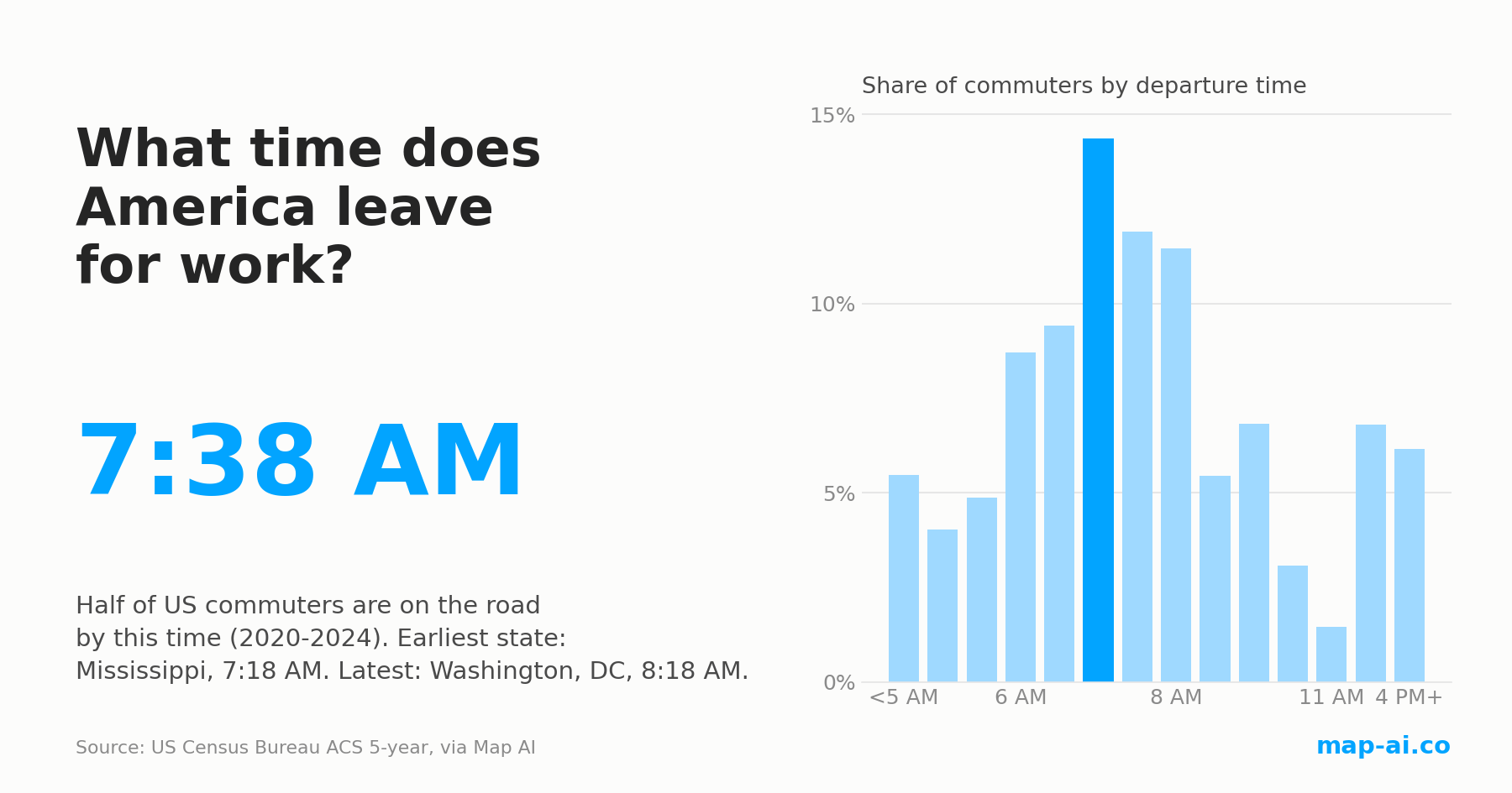
Half of US commuters are on the road by 7:38 AM, the same as in 2009. The morning still changed: here is where America starts earliest and latest.
Read more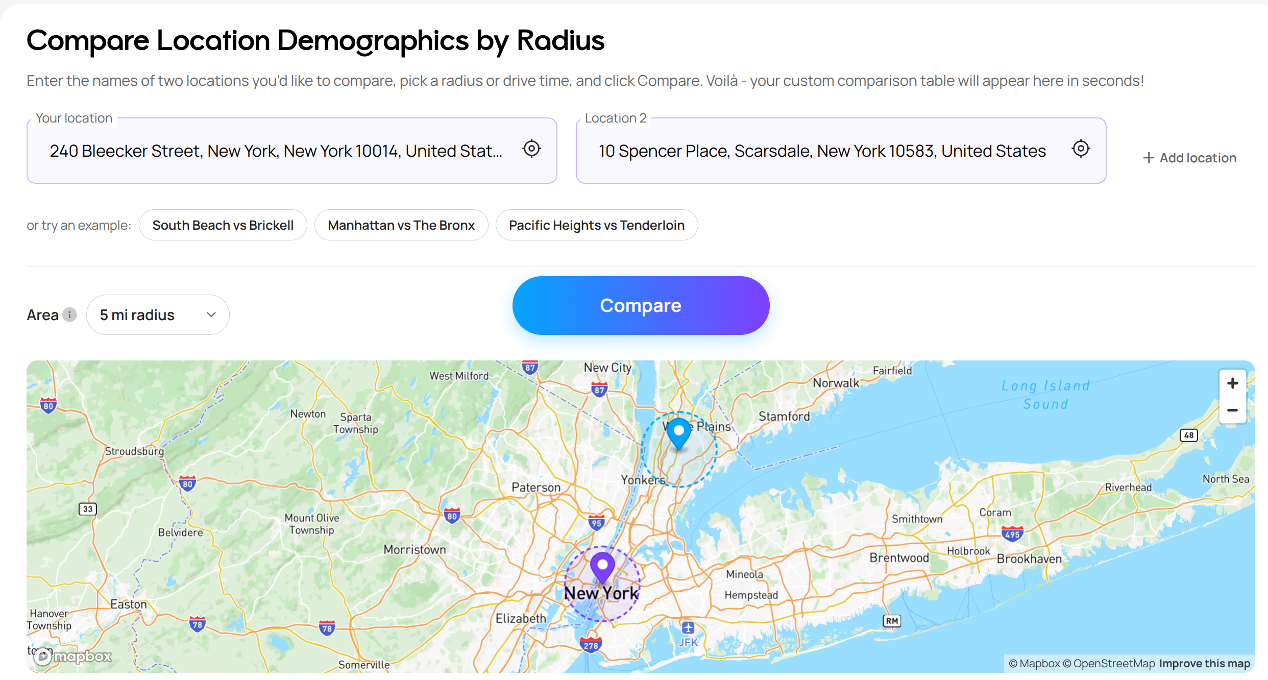
Still searching for the right place?
Use Map AI to explore, compare, and find the best fit - all with detailed insights and smart reports on any neighborhood.


