
Still searching for the right place?
Use Map AI to explore, compare, and find the best fit - all with detailed insights and smart reports on any neighborhood.

US Traffic Volume vs Commute Time: What 55 Years of Vehicle-Miles Data Predicts for 2030

September 3, 2026

14 min to read
Americans drive as much as they ever did. Far fewer of them are commuting.
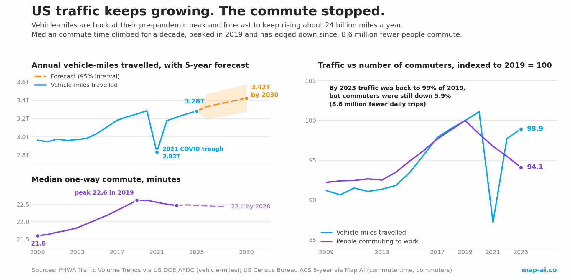
In the 12 months to February 2025, vehicles on American roads covered 3.28 trillion miles. The pre-pandemic peak, in the 12 months to February 2020, was 3.285 trillion. Traffic has come back to within one tenth of one percent of where it was.
Over the same stretch, the number of Americans who physically travel to work fell by 8.6 million.
Those two facts do not contradict each other, but together they say something specific about American roads: the traffic came back, and it is not the same traffic. This article puts the two datasets side by side, tests whether they actually move together, and fits a model to forecast both five years out.
What the vehicle-miles data shows
The traffic series here is the Federal Highway Administration's Traffic Volume Trends, published as a worksheet by the US Department of Energy's Alternative Fuels Data Center. It runs from 1971 to 2025 and covers light-, medium- and heavy-duty vehicles.
One detail matters enormously for reading it. Each year's figure is a 12-month count aggregated in February, so the row labelled 2020 covers roughly March 2019 to February 2020, which is almost entirely pre-pandemic, and the row labelled 2021 is the one that captures the lockdown year. Read the labels as calendar years and you will conclude that traffic peaked during the pandemic, which is exactly backwards.
| Period (12 months to Feb) | Vehicle-miles | Change |
|---|---|---|
| 2019 | 3.249 trillion | |
| 2020 (last pre-COVID reading) | 3.285 trillion | +1.1% |
| 2021 (lockdown year) | 2.832 trillion | -13.8% |
| 2022 | 3.175 trillion | +12.1% |
| 2023 | 3.214 trillion | +1.2% |
| 2024 | 3.249 trillion | +1.1% |
| 2025 | 3.280 trillion | +0.9% |
The lockdown cost about 453 billion vehicle-miles in a single year, a 13.8% collapse with no precedent in the 55-year series. The two oil shocks of the 1970s and the 2008 financial crisis each produced dips of one to two percent. Recovery then took four years, and 2025 still sits a hair below the 2020 reading.
Does traffic volume track commuting? It used to, and then it stopped
This is the question worth testing rather than assuming. If more people commute, and commute further, there should be more traffic. We paired the vehicle-miles series with both the median US commute time and the count of people who physically travel to work, from Census American Community Survey data for 2009 to 2023.
In levels across the full period the relationship looks strong: vehicle-miles against commute time gives r = +0.68, p = 0.006. But both series trend upward, and any two rising series will correlate, so the honest test is to strip the trend out and ask whether the year-to-year movements line up.
Do that across 2009-2023 and the relationship appears to vanish. First differences give r = +0.17 (p = 0.57) against commute time and r = +0.20 (p = 0.49) against the number of commuters. On that evidence you would conclude there is no real link at all.
That conclusion would be wrong, and the reason is instructive. The full-period test averages across two completely different regimes.
| Vehicle-miles vs number of commuters | 2009-2019 | 2019-2023 | Full 2009-2023 |
|---|---|---|---|
| Correlation in levels | +0.994 | +0.196 (p = 0.75) | +0.69 |
| Correlation in year-over-year changes | +0.794 (p = 0.006) | - | +0.20 (p = 0.49) |
Through the 2010s the link was not just real, it was tight. A correlation of +0.99 in levels is unremarkable on trending data, but +0.79 on first differences is not: that is a genuine, trend-free relationship, significant at p = 0.006, and it says that in any given year of that decade, knowing how many more people were commuting told you how much more America was driving. The same test against commute time gives r = +0.75, p = 0.012.
After 2019 it collapses. The level correlation over 2019-2023 falls to +0.20 with p = 0.75, which is no relationship at all. Averaging a strong decade with a broken four years produces the misleading full-period figure of +0.20.
So the finding is not "commuting never predicted traffic". It is that commuting predicted traffic well for a decade, and then in 2019 the relationship broke. That is a structural break, and it is far more consequential than a weak correlation would have been.
The decoupling, and the number that shows it
What makes this more than a negative result is what happened after 2019, when the two series visibly split.
| 2019 to 2023 | Change |
|---|---|
| Vehicle-miles travelled | -1.1% |
| People physically commuting to work | -5.9% (145.7M to 137.1M) |
| Vehicle-miles per commuter | +5.1% (22,299 to 23,439) |
Vehicle-miles per commuter had been remarkably stable for the previous decade, drifting up about 40 miles a year between 2009 and 2019 on a tight fit. After 2019 it jumps. Each remaining commuter now accounts for far more of the nation's driving than before, which is another way of saying that a growing share of American driving is not commuting at all. Deliveries, errands, freight, weekend travel and discretionary trips filled the space that the daily journey to work vacated.
This is the same conclusion we reached from a completely different direction in our analysis of how Americans get to work, where roadside sensor studies found that road segments with weekday commuter peaks recovered least while weekend traffic rebounded hardest. Two survey datasets and one sensor dataset now agree: total demand returned, the commute peak did not.
Forecasting traffic volume to 2030
With the relationship properly characterised, the sensible forecast uses the traffic series on its own rather than trying to drive it from commute time.
We fitted three candidate models to the 2009-2025 vehicle-miles data and selected between them by leave-one-out cross-validation, so the choice is made on out-of-sample error rather than on in-sample fit:
- Linear trend with a dummy for the 2021 COVID year: CV RMSE 0.108
- Quadratic trend with the same dummy: CV RMSE 0.111
- Linear trend with no COVID adjustment: CV RMSE 0.112
The simple linear model with a COVID dummy wins. It explains 87% of the variance, its trend term is highly significant (t = 8.25, p < 0.0001), and it puts underlying growth at 23.6 billion vehicle-miles per year. The COVID dummy is worth -379 billion miles, which is the model's estimate of the one-off lockdown effect.
| Year | Forecast vehicle-miles | 95% prediction interval |
|---|---|---|
| 2026 | 3.329 trillion | 3.192 to 3.466 |
| 2027 | 3.353 trillion | 3.213 to 3.493 |
| 2028 | 3.376 trillion | 3.234 to 3.519 |
| 2029 | 3.400 trillion | 3.254 to 3.546 |
| 2030 | 3.424 trillion | 3.275 to 3.572 |
That is 4.4% more driving in 2030 than in 2025. The intervals are prediction intervals rather than confidence intervals, so they describe where an actual future year is likely to land, not merely where the trend line sits. They are wide on purpose: a single unmodelled shock, of the kind 2021 delivered, would put the outcome outside them.
The same procedure applied to median commute time points the other way, and the next section works through that series year by year.
How the American commute changed, year by year
The traffic series above is only half of the picture. Here is the other half, in its own units.
| Year | Median one-way commute | Change on prior year |
|---|---|---|
| 2009 | 21.60 min | |
| 2011 | 21.70 min | +0.07 |
| 2013 | 21.82 min | +0.07 |
| 2015 | 22.07 min | +0.12 |
| 2017 | 22.33 min | +0.14 |
| 2019 | 22.62 min | +0.15 (peak) |
| 2021 | 22.56 min | -0.05 |
| 2023 | 22.46 min | -0.04 |
The shape is a clean inverted V, and it is unusually tidy for survey data. The median commute rose in ten consecutive years from 2009 to 2019, without a single reversal, adding 1.02 minutes in total, a 4.7% increase. Then it stopped dead. The 2020 reading is identical to 2019 to two decimal places, and every year since has been lower: 22.56, 22.50, and 22.46 in 2023.
A minute of median commute sounds trivial until it is annualised. At two trips a day across roughly 250 working days, a 21.60-minute median commute costs 180 hours a year. By 2019 that had become 188.5 hours. The decade added about eight and a half hours of travel per commuter per year, which is a working day plus a lunch break, and it arrived so gradually that no individual year felt like anything at all. Roughly six seconds a year.
What makes the reversal interesting is what it is not. This median covers only people who physically travel to work: home workers are excluded from the universe entirely rather than counted as zero-minute commutes. So the post-2019 decline is not an artefact of averaging in millions of stay-at-home zeros. Among people still making the trip, the trip itself genuinely got shorter.
The most likely mechanism is selection rather than congestion relief. Remote work did not remove trips evenly; it removed the longest ones first, because the office jobs that went remote were disproportionately the downtown jobs people travelled furthest to reach. Take a slice of long trips out of the distribution and the median of what remains falls, even if nobody's individual journey got any quicker.
Fitting the same model-selection procedure used for traffic confirms the break. A segmented model allowing the slope to change at 2019 beats both a straight line and a quadratic on leave-one-out cross-validation by roughly a factor of two, and fits at R-squared 0.976. It estimates the commute rising 0.107 minutes a year before 2019 and falling 0.014 minutes a year after, forecasting 22.43 minutes by 2028. In other words the decade-long climb has not merely paused, it has inverted, but the new downward slope is roughly eight times shallower than the old upward one. On present evidence the commute is flat, not shrinking.
Two caveats belong with this series. These are ACS five-year estimates, so each figure averages the five years ending in the labelled year and the true turning point is likely a little earlier than 2019 as plotted. And a national median conceals a genuine split: 23 states saw the median commute fall between 2019 and 2023 while 28 saw it rise, with the falls concentrated in high-remote-work states such as Maryland and Illinois, both down about 1.9 minutes, and the rises in car-dependent states with little remote work. That geography is covered in detail in our analysis of how Americans get to work.
Set the two series side by side and the divergence is the whole point of this article. Traffic is forecast to grow about 24 billion vehicle-miles a year through 2030. The commute, after a decade of reliably lengthening, is forecast to sit within a few seconds of where it is now. Whatever fills America's roads over the next five years, it is not a longer journey to work.
Every state is different, and the biggest ones diverge most
National totals hide the thing that matters for anyone planning a specific site or corridor. Traffic is extraordinarily concentrated: according to TrafficZoom's US traffic count data, California alone carries 927,539,301 vehicle-miles per day, 12.2% of all US travel measured, followed by Texas at 735,449,278 (9.7%) and Florida at 524,298,426 (6.9%). Those three states carry 28.8% of the country's traffic between them.
They are also the states where a national forecast is least useful, because their commute trajectories point in opposite directions:
| State | Daily vehicle-miles | Commute time 2019 to 2023 | Car commuters added since 2009 |
|---|---|---|---|
| California | 927.5 million (12.2%) | 25.0 to 23.6 min (-1.4) | +0.13 million |
| Texas | 735.4 million (9.7%) | 22.7 to 22.7 min (flat) | +1.90 million |
| Florida | 524.3 million (6.9%) | 23.8 to 23.9 min (flat) | +0.85 million |
California's remote-work shift genuinely relieved its commute: its work-from-home share went from 4.8% to 15.5%, physical commuters fell 9.5%, and the median commute dropped 1.4 minutes. Despite fourteen years of population growth it added only about 130,000 car commuters.
Texas and Florida did the opposite. Both saw work from home rise by roughly the same amount, around 9 points, but growth swamped it: between them they added 2.75 million car commuters, and neither saw its commute time improve. The national story of relief through remote work simply does not apply there.
The lesson for anyone forecasting a specific location is that the sign of the effect flips between the country's two largest traffic states. A model built on national averages will be wrong in both, in opposite directions.
Why measurement matters more than the forecast
The honest summary of this analysis is that a national trend model gets you a defensible number with a wide interval, and that the interesting variation lives well below the national level. That is an argument for measurement rather than extrapolation.
Ticon makes this case directly in historical traffic data is the foundation for mobility improvement: you cannot improve what you have not measured over time, and a long, consistent history of counts on a specific road is what separates a real capacity decision from a guess. Our own results support the point from the statistical side. The relationship between commuting and traffic held for a decade and then broke without warning, and the informative signal turned out to be a state-level divergence invisible in the national series. A model inferring road demand from commuting would have been quietly wrong from 2019 onward; a counter on the road would not.
For current, segment-level volumes rather than national aggregates, TrafficZoom's US traffic count data provides AADT and per-segment counts. Use national vehicle-miles for the macro trend, and counts for anything where the answer depends on a particular road.
Conclusion: commuting is no longer a proxy for traffic
For most of the 2010s, the number of Americans commuting was an excellent estimator of how much America drove. The two series moved together in levels at r = +0.99 and, more tellingly, tracked each other year by year at r = +0.79. A planner who knew the commuter count knew the traffic.
That is no longer true, and the size of the break is easy to state. Between 2019 and 2023 the number of people physically commuting fell 5.9%. Vehicle-miles fell 1.1%. Traffic moved only about 18% as much as commuting did.
The counterfactual makes it concrete. Had driving continued to track commuting one-for-one after 2019, 2023 vehicle-miles would have come in at roughly 3.06 trillion. The actual figure was 3.214 trillion. That gap of about 156 billion vehicle-miles, close to 5% of all American driving, is travel that exists for reasons other than the journey to work: deliveries, freight, errands, weekend and discretionary trips. It did not replace the commute so much as reveal how much non-commute travel had been there all along, previously masked by a commute that moved in the same direction.
Three practical consequences follow.
- Commute-based demand models are calibrated to a relationship that no longer holds. Any forecast that scales road demand from employment or commuter counts inherited its coefficients from the pre-2019 regime. On the 2019-2023 evidence those coefficients now overstate the response of traffic to commuting by roughly a factor of five.
- Total volume and peak volume have separated. Traffic is forecast to reach 3.42 trillion vehicle-miles by 2030 while median commute time flatlines near 22.4 minutes. Roads will get busier without the weekday commute peak returning to what it was, which is a different capacity problem from the one most networks were designed around.
- The national number hides the decision. California cut its commute while Texas and Florida added 2.75 million car commuters between them. A relationship that broke nationally did not break identically in every state, and for any specific corridor the national average is the wrong input.
The general lesson is that a relationship holding for a decade is not the same as a law. This one held tightly enough that using it would have felt safe right up until the year it stopped working, and no amount of pre-2019 data would have warned you. That is the strongest argument for measuring roads directly rather than inferring them from commuting.
How we did this and where the data comes from
Two independent datasets, deliberately kept separate:
- Traffic volume: Federal Highway Administration monthly Traffic Volume Trends, distributed as a worksheet by the US Department of Energy Alternative Fuels Data Center, series 10315, last updated January 2026. Annual figures are 12-month vehicle-miles aggregated in February of the labelled year, covering light-, medium- and heavy-duty vehicles. 1971 to 2025.
- Commute data: US Census Bureau American Community Survey five-year estimates, means of transportation to work and travel time to work, aggregated by Map AI from census tract and block group level. Windows ending 2009 to 2023.
- State traffic volumes: TrafficZoom US traffic count data.
Method notes:
- The two series have different vintages. Vehicle-miles are annual counts; the ACS figures are five-year averages labelled by end year. This limits how precisely they can be aligned, and is one more reason to treat the level correlation sceptically.
- Commute time is a grouped median over travellers only, computed from ACS travel-time brackets. People who work from home are excluded from that universe rather than counted as zero-minute commutes.
- Model selection used leave-one-out cross-validation, not in-sample R-squared, so the chosen specification is the one that predicts held-out years best.
- Intervals are 95% prediction intervals derived from the OLS residual variance, and they widen with distance from the sample mean. They do not account for structural breaks, policy changes, fuel price shocks or another pandemic.
- Vehicle-miles include freight. Comparing them against a commuter count is a comparison of two different things by design; that mismatch is part of what the decoupling measures.
- The 2019 break was identified visually and confirmed by split-sample correlation, not by a formal structural-break test such as Chow or Bai-Perron. With fifteen annual observations there is limited power for such a test, so the split should be read as descriptive rather than as a formally dated breakpoint.
See more
Read the companion piece on the commuting side of this story: How Americans get to work: car, transit and remote work by state, which covers the mode shift, the state rankings and the work-from-home effect in detail.
Sources:
- US Department of Energy, Alternative Fuels Data Center, Annual Vehicle Miles Traveled in the United States (series 10315), sourced from the Federal Highway Administration Traffic Volume Trends report
- US Census Bureau, American Community Survey five-year estimates, aggregated by Map AI
- TrafficZoom, US traffic count data
- Ticon, Historical traffic data is the foundation for mobility improvement
Explore commute and traffic data for any US state or county: California, Texas, Florida, or the United States commute overview.

Retirement-friendly

or dominated by young professionals.

Understanding factors like age demographics, neighborhood income, crime rates, and education ranking allows you to feel the vibe of the area more deeply. With Map AI, it’s a breeze to dig into the demographics of any area!
Open mapInstead of manually compiling data from multiple sources, our platform provides real-time insights, saving you time and effort while delivering accurate and actionable information.
Here’s how it works:
1. Launch the platform in your browser.
2. Find the location you’re interested in, by entering an address on the left.
3. Choose the level of data granularity – 1 mi, 5 mi, county or a state.
4. In the menu bar on the right, go to the "Charts" section and select "Population".
5. Click on the neighborhood you’re curious about to view the data.
And voilà!
An interactive map pops up, layered with data on age groups, income brackets, education levels, and even population density.

It’s like having a real estate crystal ball! Whether you’re prioritizing schools, nightlife, or a specific community vibe, Map AI helps you match your lifestyle to the perfect spot. No more guessing or endless Googling—just actionable insights in a few clicks.
Ready to explore? Head to https://interactive-map-ai.com/ and start mapping your future neighborhood today!
Map AI makes exploring demographics easy with its interactive, user-friendly platform. Offering detailed maps and customizable filters, Map AI lets you visualize key demographic data such as age distribution, population density by county, by zip and less, median household income map, and family structures across different neighborhoods. You can access real-time data to make more informed decisions about where to live based on the community that best matches your needs and lifestyle.
Open mapBy using Map AI, you’ll save time and gain a deeper understanding of your potential new home, ensuring you choose the perfect neighborhood for your future.
Check my neighborhoodHere’s why school rankings matter and how Map AI can help you make the best choice.
Why school rankings matter1. Property Value Impact
Homes located in areas with top-rated schools tend to have higher property values and greater potential for long-term appreciation. School quality is a key factor that many homebuyers consider, even if they don’t have children, because it signals a desirable neighborhood with solid community investment.2. Better Educational Opportunities
For families, the proximity to high-ranking schools can be a major deciding factor. Good schools provide better educational opportunities for children, which can translate into future success. Access to quality education is often viewed as a key benefit of living in certain neighborhoods.3. Community Environment
A strong school system often attracts young families, creating a vibrant, family-friendly community. This can lead to a positive social environment with access to various community activities, events, and local organizations.
How Map AI makes comparing school districts simple
Map AI simplifies the process of comparing school districts by offering interactive maps that display school rankings across different neighborhoods.

With just a few clicks, you can visualize how schools in a specific area stack up against each other, compare performance ratings, and see reviews from local residents.
Open mapBy using Map AI, you can make informed decisions about where to buy, ensuring that the neighborhood not only fits your lifestyle but also provides access to the best educational opportunities. Whether you're focused on top-performing schools or simply want to know how a school compares in the area, Map AI makes this data easily accessible and actionable.
Incorporating school rankings into your property search is easy when you have the right tools. With Map AI, you can confidently select a neighborhood that provides excellent education for your children and enhances your home’s long-term value.
For a comprehensive, data-driven approach to analyze a neighborhood, Map AI is the tool you can't afford to miss.
Compare neighborhoodsHow Map AI makes сrime heatmaps easy to use
Map AI takes the power of crime heatmaps to the next level with its user-friendly platform. With just a few clicks, you can explore crime rates by neighborhood that display real-time crime data across America. Map AI’s intuitive interface allows you to customize filters, adjusting the map based on the type of crime you're concerned about, such as violent crimes or property thefts.
You can also zoom in on specific areas to see localized crime patterns, giving you a more detailed view of safety at a granular level. The easy-to-read heatmap visuals make it simple to compare areas, helping you narrow down the safest areas to live in with confidence.
By using Map AI, you get access to accurate, real-time crime data in an easy-to-understand format, making it a must-have tool in your homebuying journey. With Map AI you can make informed decisions that prioritize your safety and peace of mind.
Let us help guide you to the safest places for your next home.

Then select “Filters” from the menu on the right side, choose "Housing" – “Median gross rent” / “ Median home value”, and set your budget.

The map highlights these towns in green, showing median home prices and rental rates.

Zoom in to explore schools, parks, and shopping options—everything a homebuyer needs to decide. Forget endless searches; Map AI puts affordability and convenience on one screen. Check it out at https://interactive-map-ai.com and start planning your move today!
Just for you
What Time Do Americans Leave for Work? Commute Start Times by State and County
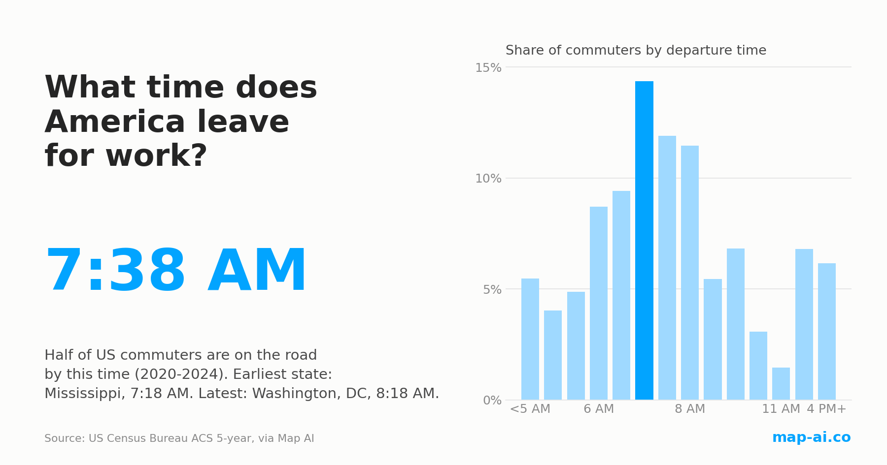
Half of US commuters are on the road by 7:38 AM, the same as in 2009. The morning still changed: here is where America starts earliest and latest.
Read more
Still searching for the right place?
Use Map AI to explore, compare, and find the best fit - all with detailed insights and smart reports on any neighborhood.


